The classic kitchen, a timeless sanctuary of culinary creativity, often evokes images of warm wood, gleaming stone, and a sense of enduring sophistication. But the heart of its aesthetic appeal often lies in the carefully chosen color palette. Neutral colors, far from being bland, offer a versatile foundation upon which to build a kitchen that exudes both serenity and style.
Their inherent adaptability allows for the incorporation of diverse textures, materials, and accent colors, ultimately creating a space that is both visually captivating and functionally efficient. This exploration delves into the science of color psychology as it applies to kitchen design, examining how different shades of neutral hues can transform a space, influencing mood and enhancing the overall culinary experience.
Understanding the principles of light reflection and absorption is crucial in selecting the perfect neutral tones. Warm neutrals, such as creams and beiges, tend to absorb light, creating a cozier, more intimate atmosphere, while cool neutrals, like grays and certain whites, reflect light, resulting in a brighter, more spacious feel. The interplay of these factors, coupled with the strategic use of textures and materials, allows for the creation of a truly bespoke classic kitchen, tailored to individual preferences and the specific architectural characteristics of the space.
Defining Classic Kitchen Style

The classic kitchen transcends fleeting trends, embodying enduring elegance and timeless functionality. Its design principles, rooted in historical aesthetics and practical considerations, continue to inspire contemporary interpretations. Understanding the core elements of classic kitchen design allows for informed choices in creating a space that is both beautiful and efficient.Classic kitchen design prioritizes enduring quality and craftsmanship over fleeting fashion.
It emphasizes clean lines, balanced proportions, and the strategic use of high-quality materials to create a space that ages gracefully. The overall effect is one of refined simplicity, often achieving a sense of calm and sophistication.
Defining Characteristics of Classic Kitchen Design
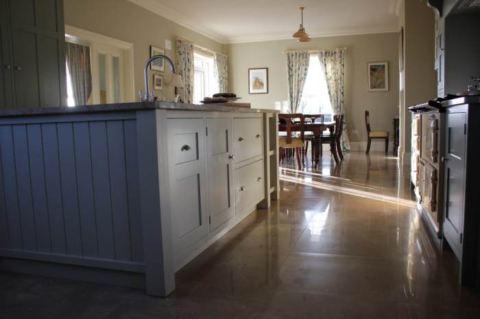
Classic kitchens are characterized by a focus on symmetry, balance, and proportion. Common design elements include paneled cabinetry, often with raised or recessed panel doors, integrated appliances, and functional yet aesthetically pleasing hardware. The color palette typically leans towards neutral tones, such as creamy whites, soft beiges, and muted grays, providing a versatile backdrop for accent pieces. Natural light is often maximized through the use of large windows and strategically placed lighting fixtures.
A sense of order and calm is paramount.
Materials Used in Classic Kitchens
The selection of materials in a classic kitchen emphasizes durability and inherent beauty. Solid wood, particularly hardwoods like cherry, oak, and maple, is a mainstay, prized for its warmth, resilience, and ability to age gracefully. Natural stone, such as marble, granite, and limestone, is frequently used for countertops and backsplashes, offering both visual appeal and exceptional durability. Other materials commonly found in classic kitchens include porcelain tile, often in large format for a clean, modern look, and brass or nickel hardware, adding subtle accents of metallic warmth or cool sophistication.
Typical Layout and Functionality of a Classic Kitchen
Classic kitchen layouts often prioritize efficiency and functionality. The work triangle—the arrangement of the sink, stove, and refrigerator—is a key consideration, ensuring smooth workflow and minimizing unnecessary movement. While various layouts exist, the classic kitchen often features a galley or L-shaped configuration, optimizing space utilization in both larger and smaller kitchens. Ample counter space, often complemented by an island or peninsula, provides ample room for food preparation and storage.
Storage solutions are integrated seamlessly into the design, minimizing clutter and maximizing functionality.
Examples of Classic Kitchen Styles from Different Eras
The classic kitchen style has evolved over time, reflecting the architectural and design trends of each era. The Victorian era (late 19th century) featured ornate detailing, dark wood cabinetry, and elaborate tilework. The Arts & Crafts movement (late 19th and early 20th centuries) embraced simpler lines, handcrafted details, and natural materials. Mid-century modern kitchens (mid-20th century) incorporated clean lines, minimalist aesthetics, and integrated appliances, often featuring pastel colors and sleek metallic accents.
Each era has contributed to the rich tapestry of what we now consider classic kitchen design, creating a style that is both historically rooted and perpetually relevant.
Exploring Neutral Color Palettes

The selection of a neutral color palette for a classic kitchen is crucial. Neutral colors provide a timeless backdrop, allowing for flexibility in future updates and preventing the space from feeling dated. The psychology of color also plays a role; neutrals promote a sense of calm and order, essential qualities in a frequently used space like a kitchen.
Understanding the subtle differences between shades and tones within these palettes is key to achieving the desired atmosphere.
A carefully chosen neutral palette can enhance the architectural details and natural light of a classic kitchen, creating a sophisticated and welcoming environment. The following sections explore the versatility of various neutral shades and their application in classic kitchen design.
Neutral Color Palette for Classic Kitchens
A classic kitchen benefits from a palette that is both versatile and elegant. The following five neutral colors, with their hex codes, offer a range of options for achieving a sophisticated and timeless look:
- Cloud White (#F8F8FF): A soft, bright white that reflects light effectively, ideal for smaller kitchens or those with limited natural light.
- Warm Gray (#A9A9A9): A versatile mid-tone gray that pairs well with both warm and cool accents, offering a sophisticated and understated elegance.
- Creamy Beige (#F5F5DC): A warm, inviting beige that evokes a sense of comfort and traditional charm, perfect for creating a cozy atmosphere.
- Oyster White (#EEE8AA): A slightly off-white with subtle yellow undertones, adding warmth without being overly yellow.
- Silver Gray (#C0C0C0): A cooler gray that offers a more contemporary feel while still maintaining a classic sensibility.
Variations in White for Classic Kitchens
White, despite its seeming simplicity, offers a vast spectrum of shades, each impacting the overall feel of a kitchen. Subtle differences in undertones – whether warm (yellowish or creamy) or cool (bluish or grayish) – significantly alter the perceived temperature and ambiance.
For instance, a pure white like Bright White (#FFFFFF) can feel stark and modern, while a warmer off-white like Antique White (#FAEBD7) provides a softer, more traditional feel. A cool white, such as Swiss Coffee (#F7F7F7), can create a crisp, airy atmosphere, especially beneficial in kitchens with ample natural light. Using different shades of white on cabinetry, walls, and trim allows for visual interest and depth without compromising the overall neutral scheme.
Beige, Gray, and Cream Tones in Classic Kitchen Design
Beige, gray, and cream tones offer a wealth of options for creating a classic kitchen design. Beige, with its warm undertones, provides a welcoming and inviting atmosphere. The choice between light and dark beige influences the overall brightness of the space; lighter beiges enhance brightness, while darker beiges create a more intimate setting.
Gray, in contrast, offers a more contemporary and versatile option. Light grays can create a sense of airiness, while darker grays add depth and sophistication. The undertones of gray – whether cool (bluish) or warm (brownish) – can be used to complement other elements in the kitchen. Cream tones, similar to beige, offer warmth and elegance, creating a sophisticated and timeless look.
Their versatility allows for easy pairing with various metals, countertops, and backsplashes.
Warm versus Cool Neutral Tones in Classic Kitchens
The choice between warm and cool neutral tones significantly influences the overall atmosphere of a classic kitchen. Warm neutrals, such as beiges and creams, evoke feelings of comfort and coziness, creating a welcoming and inviting space. These tones are often associated with traditional design styles and work well with natural materials like wood.
Cool neutrals, such as grays and some whites, offer a more contemporary and sophisticated feel. They can create a sense of spaciousness and airiness, particularly effective in smaller kitchens. The selection depends on personal preference and the desired ambiance. A balanced approach, incorporating elements of both warm and cool neutrals, can achieve a harmonious and visually appealing result.
Neutral Color Combinations for Classic Kitchens
| Color Combination | Paint Name (Example) | Manufacturer (Example) | Description |
|---|---|---|---|
| Creamy Beige & Warm Gray | “Oatmeal” & “Silver Sage” | Benjamin Moore | Creates a balanced and sophisticated look with a touch of warmth. |
| Cloud White & Oyster White | “Cloud Nine” & “Seashell” | Sherwin-Williams | Offers a bright, airy feel with subtle textural contrast. |
| Warm Gray & Silver Gray | “Twilight Gray” & “Steel” | Farrow & Ball | Provides a contemporary feel with a sophisticated monochromatic scheme. |
| Creamy Beige & Cloud White | “Vanilla Bean” & “White Dove” | Behr | Combines warmth and brightness for a welcoming and airy kitchen. |
Neutral Colors in Different Kitchen Elements

The judicious application of neutral colors in a kitchen significantly impacts the overall aesthetic and perceived spaciousness. Understanding how these colors interact with different materials and lighting conditions is crucial for achieving a cohesive and visually appealing design. This section explores the versatile role of neutral tones in various kitchen components.
Neutral Colors on Kitchen Cabinets
Neutral-toned kitchen cabinets offer timeless elegance and adaptability. Shades of white, off-white (like creamy ivory or warm greige), and light gray are popular choices. White cabinets, for instance, maximize light reflection, making smaller kitchens appear larger. They also provide a clean, crisp backdrop that complements various countertop and backsplash materials. Off-whites introduce warmth and visual texture, softening the starkness of pure white.
Light gray cabinets offer a sophisticated, modern feel, particularly effective in kitchens with stainless steel appliances. Darker neutral shades, such as charcoal gray or deep taupe, create a dramatic, luxurious atmosphere, best suited for larger kitchens with ample natural light. The psychological impact of these choices is noteworthy; lighter colors generally promote a sense of openness and calmness, while darker neutrals evoke a feeling of coziness and sophistication.
Neutral Colors on Kitchen Countertops
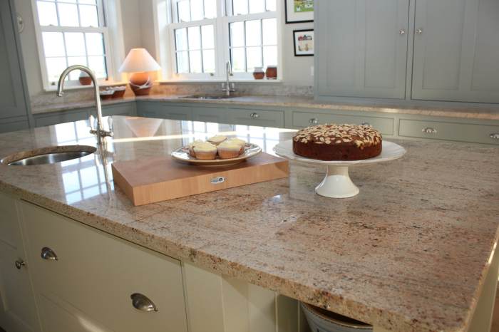
The countertop is a focal point in any kitchen, and neutral colors provide a versatile foundation. Granite, quartz, and marble are common choices, each offering a unique visual texture and durability. Neutral granite countertops often feature subtle veining in shades of beige, gray, or brown, adding visual interest without overpowering the space. Quartz countertops, known for their stain resistance, are available in a wide range of neutral colors, including pristine white, warm beige, and soft gray.
Marble, with its characteristic veining patterns, adds a touch of classic elegance; neutral marble variations often feature gray, white, and beige tones. The selection depends on factors such as desired level of maintenance, budget, and the overall aesthetic vision. For example, a busy pattern on a countertop might clash with a busy backsplash.
Neutral Colors in Backsplash Design
The backsplash serves as a visual bridge between the countertops and upper cabinets. Neutral colors in this area offer design flexibility.
- Subtle Textured Tiles: A light gray or beige subway tile backsplash provides a classic, understated look that complements most neutral cabinet and countertop choices. The subtle texture adds visual interest without being overpowering.
- Large-Format Neutral Tiles: Large format tiles in a neutral tone, such as a creamy white or light taupe, create a clean, modern look. The fewer grout lines minimize visual clutter, enhancing the sense of spaciousness.
- Neutral Mosaic Tiles: A mosaic backsplash featuring a mix of neutral tones, such as beige, gray, and white, adds visual interest and texture. The variation in shades prevents monotony while maintaining a cohesive neutral palette.
Neutral Colors in Kitchen Flooring
Neutral-colored flooring provides a stable base for the overall kitchen design. Hardwood floors in light oak or maple offer warmth and classic appeal, while darker hardwood floors, like walnut or cherry, create a more formal atmosphere. Tile flooring in neutral shades, such as beige, gray, or white, is a durable and easy-to-clean option, suitable for high-traffic areas. The choice depends on factors like durability needs, style preferences, and the overall feel desired.
For instance, hardwood might be less practical in a kitchen prone to spills compared to durable tile.
Neutral Color Schemes for Kitchen Walls Considering Lighting Conditions
The impact of lighting on wall color is significant. The following schemes illustrate the interplay between neutral tones and various lighting conditions:
- Low Light: Warm, creamy whites or light beige to reflect light and create a brighter feel.
- Moderate Light: Soft grays or greige (a blend of gray and beige) offer a balance of warmth and neutrality.
- Bright Light: Crisp white or very light gray to prevent the space from feeling overly bright or washed out.
Adding Visual Interest with Accents
A classic kitchen, while anchored in neutral tones, thrives on the strategic introduction of accents. These accents, carefully chosen and thoughtfully placed, prevent monotony and inject personality without compromising the timeless elegance of the design. The key lies in understanding the interplay of color, texture, and light to create a visually stimulating yet cohesive space.
The power of accent colors lies in their ability to highlight specific features and introduce a sense of vibrancy. In a neutral-toned classic kitchen, a deep, saturated color can act as a focal point, drawing the eye and adding warmth. Consider a rich navy blue on the kitchen island, providing a striking contrast against creamy cabinetry and pale countertops.
This not only defines the island as a key feature but also introduces a sense of sophistication. Alternatively, a warm terracotta, used in a patterned backsplash tile, adds a rustic touch, complementing the clean lines of the cabinetry. A soft sage green, perhaps on the kitchen’s window seating area, injects a sense of tranquility and freshness. The choice of accent color should reflect the desired mood and overall aesthetic.
Metallic Accents in Classic Kitchens
Metallic accents, such as gold, silver, or copper, offer a sophisticated way to enhance a neutral color scheme. The reflective qualities of metals add depth and luminosity, especially in spaces with limited natural light. Gold fixtures, for instance, can imbue a feeling of opulence and warmth, particularly when paired with white or cream cabinets. The warm tones of copper, on the other hand, offer a more rustic and inviting feel, complementing wooden elements.
Silver accents, with their cool and modern vibe, provide a more contemporary twist to a classic design. These metals can be incorporated through hardware (cabinet knobs, drawer pulls), lighting fixtures, or even decorative elements like trays or bowls. The key is to use them sparingly to avoid overwhelming the space.
Natural Textures for Visual Depth
The incorporation of natural textures offers another avenue for enriching the visual landscape of a neutral kitchen. Wood, in particular, adds warmth and character. Wooden countertops, shelving, or even a wooden kitchen island introduce a tactile element that contrasts beautifully with the sleekness of neutral surfaces. Woven materials, such as rattan or bamboo, can be incorporated through bar stools, pendant lights, or even open shelving, bringing in a touch of organic texture.
These elements add visual interest without introducing additional color, allowing the neutral palette to remain the dominant feature while simultaneously preventing a sterile appearance. The varied textures create a sense of depth and richness, adding layers of interest to the space.
Lighting Fixtures in Neutral Kitchens
Lighting plays a pivotal role in shaping the ambiance of a kitchen. In a neutral-toned classic kitchen, lighting fixtures can serve as both functional elements and design statements. A statement pendant light above the kitchen island, for instance, can be a striking focal point. A sleek, modern pendant light in brushed nickel would complement a minimalist aesthetic, while a more ornate, traditional chandelier in brass or gold could enhance a more formal style.
Recessed lighting provides functional illumination, while under-cabinet lighting accentuates countertops and workspaces. Task lighting, such as adjustable spotlights, can be strategically placed to highlight specific areas. The interplay of ambient, task, and accent lighting creates a layered and dynamic lighting scheme, further enhancing the visual appeal of the neutral kitchen. Consider the use of warm-toned LED bulbs to create a cozy atmosphere, enhancing the inviting nature of the space.
Illustrative Examples of Neutral Classic Kitchens

The enduring appeal of classic kitchen design lies in its timeless elegance and adaptability. Neutral color palettes, in particular, offer a versatile foundation upon which to build a sophisticated and functional space. By carefully selecting materials and finishes, one can create a kitchen that feels both inviting and refined, transcending fleeting trends. The following examples showcase how different neutral schemes can achieve distinct atmospheres.
Classic Kitchen Example 1: Warm White and Natural Wood
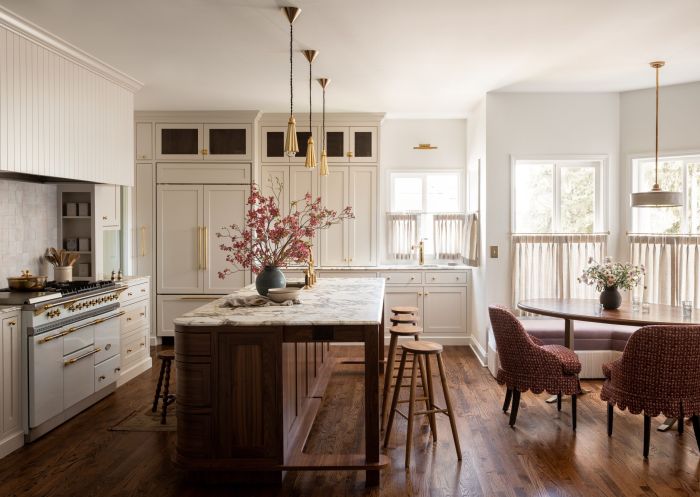
This kitchen embodies a sense of airy spaciousness and understated warmth. The cabinetry is crafted from light-toned oak, its natural grain adding visual texture without overwhelming the space. These cabinets are complemented by countertops made from creamy white marble, which reflects light beautifully and introduces subtle veining for added interest. The backsplash features large, off-white ceramic tiles with a slightly textured surface, echoing the warmth of the wood. The flooring is wide-plank, light oak, maintaining consistency with the cabinetry. Recessed lighting, supplemented by a central pendant light fixture in brushed nickel, provides ample illumination, enhancing the overall bright and welcoming feel. The overall mood is one of relaxed sophistication, ideal for a family home.
Classic Kitchen Example 2: Cool Gray and Polished Concrete
This design prioritizes a modern, minimalist aesthetic. The cabinetry is a sophisticated shade of cool gray, providing a sleek and contemporary backdrop. The countertops are polished concrete, a material known for its durability and industrial chic. Its smooth, cool surface contrasts beautifully with the gray cabinets. The backsplash is composed of small, glossy gray tiles, mirroring the cabinets’ hue but adding a subtle shimmer. The flooring is a dark gray porcelain tile, lending a sense of grounded stability to the overall design. Under-cabinet lighting is employed strategically to highlight the countertops and cabinetry, creating a dramatic and modern feel. The atmosphere is refined and sophisticated, suited to a contemporary home with a focus on clean lines.
Classic Kitchen Example 3: Taupe and Carrara Marble
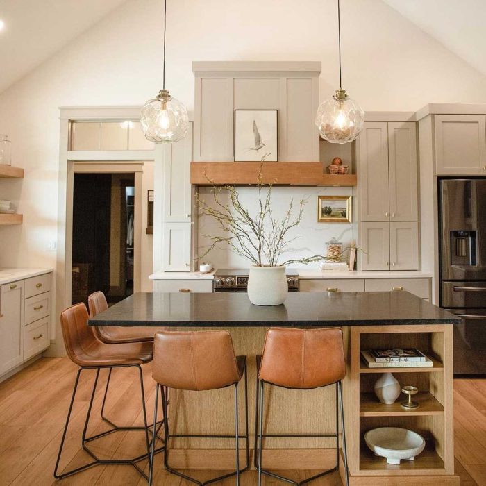
This kitchen offers a luxurious and timeless elegance. The cabinetry is a rich taupe, a warm neutral that provides depth and sophistication. These cabinets are paired with countertops made from classic Carrara marble, its distinctive veining adding a touch of drama and visual interest. The backsplash is a subtle mosaic of taupe and cream glass tiles, reflecting light and adding texture. The flooring is a pale beige travertine, which complements both the cabinetry and countertops without competing for attention. The lighting consists of a combination of recessed lighting and elegant crystal pendant lights, adding a touch of glamour to the space. The overall mood is luxurious and inviting, perfect for a formal or upscale setting.
Ending Remarks
In conclusion, the strategic implementation of neutral colors in a classic kitchen design offers a pathway to creating a space that is both aesthetically pleasing and functionally superb. By understanding the nuances of color psychology, material properties, and lighting dynamics, homeowners can craft a kitchen that reflects their personal style while remaining firmly rooted in the enduring elegance of classic design.
The versatility of neutral palettes, combined with the thoughtful integration of accent colors and textures, allows for the creation of a kitchen that is not only visually stunning but also a true reflection of its inhabitants’ unique tastes and culinary passions. The journey from concept to completion is one of careful consideration, blending scientific understanding with artistic intuition to achieve a harmonious and enduring space.
Query Resolution
What are the best neutral paint brands for classic kitchens?
Several high-quality paint brands offer excellent neutral shades, including Benjamin Moore, Sherwin-Williams, Farrow & Ball, and Behr. The best choice depends on factors like desired finish and budget.
How can I make a neutral kitchen feel warmer?
Incorporate warm-toned neutrals like creamy whites or beige, use warm-toned lighting (e.g., incandescent or warmer-toned LEDs), and add natural wood elements for a cozy atmosphere.
Can I use dark neutral colors in a classic kitchen?
Darker neutrals like charcoal gray or deep taupe can work beautifully in a classic kitchen, especially with ample natural light. They can create a sophisticated and dramatic ambiance. Consider using lighter neutrals elsewhere to balance the darkness.
How important is natural light when choosing neutral colors?
Natural light significantly impacts how neutral colors appear. North-facing kitchens with less light may benefit from warmer neutrals, while south-facing kitchens with abundant light can handle cooler tones.
What are some affordable ways to add visual interest to a neutral kitchen?
Affordable options include incorporating patterned textiles (e.g., a patterned rug or curtains), adding open shelving to display colorful dishware, or using inexpensive artwork or plants as accents.
